You’ve got your website up and running and as far as you know, you’re receiving plenty of hits.
But when it comes to web development and design maybe you’re not as up-to-date as you could be. Do you understand the importance of responsive web design?
If your answer is no, you’re probably not receiving as many hits as you think.
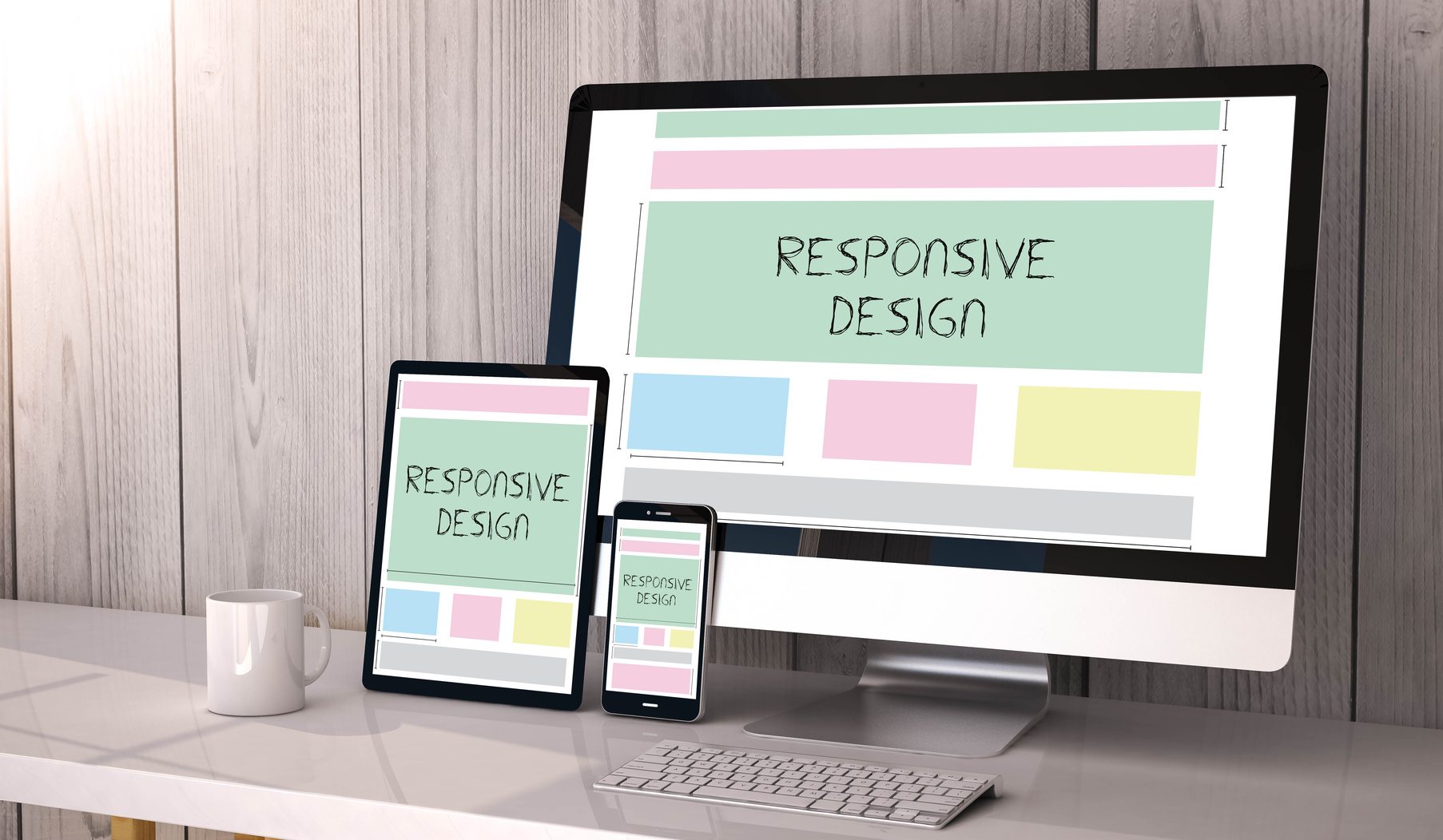
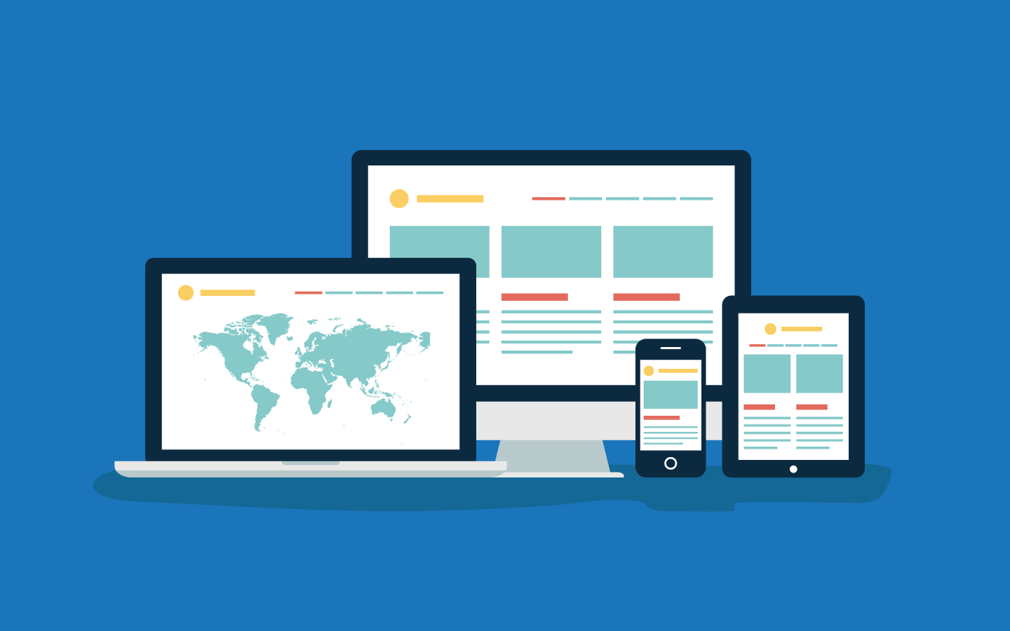
What is Responsive Web Development and Design?
You know how sometimes you visit your favorite websites on your computer, but other times you visit them on your phone? If those websites are working well and working quickly, most likely their designers have used responsive web development and design.
In a nutshell, responsive design uses only one URL for the mobile and web formats. That doesn’t immediately sound like something to get excited about, but listen:
If you only have one URL for your web-based site and your mobile-based site, your customers have a better experience because the user interface is more streamlined. Also, the Google search optimization on mobile devices tends to favor streamlined interfaces.
In other words, you don’t want a tiny version of your desktop on your cell phone, right? And without responsive design, that’s basically what you get: Buttons that are too small to click, horizontal scrolling, etc.
What’s in it for your customers?
The short answer is that responsive web development and design is just easier to use.
A website that’s easy to navigate on any type of device is typically a website a customer is happy to spend time on. No argument.
Now, whether or not user engagement impacts SEO is debatable, but you should err on the side of caution.
User engagement is measured by bounce rate, time on a page, load time, and pages per session. Responsive web development and design aids in ensuring each of the four is optimal for the customer and for you.
What’s in it for your business?
According to Tech.co, a more effective SEO strategy is in it for you–which means better search engine results, and ultimately more customers.
“SEO experts say that maintaining your one mobile site will be easier with a single pack of hypertext links, allowing SEO teams to focus on expanding your business through effective SEO strategy,” Tech.co writes.
Designrfix.com explains that responsive web design “also takes into consideration factors like screen size, pixel resolution, optimized markup, click versus touch” among other things.
All of those factors lead to better SEO because Google prefers it and that will improve your search ranking.
How far will responsive design go?
It’s hard to answer that question. One innovation that we’ll start seeing in 2017 is that websites will be responsive to the point that they alter the experience for the very old and the very young, rather than appearing as a one size fits all.
The idea is that the website will use metadata to determine a user’s age, then adapt accordingly.
For instance: an elderly user will be assumed to have poor vision so the font size will increase and the color scheme and number of animations and other distractions might decrease; a child’s experience might also include larger font size but will keep the animations and colorful graphics.
Stay on Top of the Game
As with any fast-changing field, you’ll do best to stay on top of the wave rather than get rolled under. If you haven’t already, reconfigure your website to take responsive design into account.
If you need help, click here.

