WordPress Website Design: Introduction
You could sell the most extraordinary products in the world and create amazing content, but if your website is designed poorly, you are only damaging your business. WordPress website design has become an increasingly popular topic in recent years, and for good reason.
It might sound like an exaggeration, but it’s the truth. Sure, in an ideal world people would only be interested in how your products perform and the quality of your content. But this isn’t a perfect world. People can’t help but judge a book by its cover.
Think about it this way:
You go to a five-star restaurant and receive the best steak you have ever tasted. Not only does it taste divine, but the plating is a piece of art. Now imagine eating the same delicious steak but on plastic plates and with some pepper sauce squirted on top of it. The food is the same, but the effect is different, and it’s going to affect your taste buds whether you are aware of it or not.

Even though it seems silly, a steak served on a paper plate will never taste as good as this. The same principle applies to your website design.
The same goes for your WordPress website design. Even with the best products or services in your industry, you won’t see the conversion rates you deserve if the design of your blog is all over the place.
In today’s post, we are going to show you the most important elements every website must include. We’re also going to teach you what you need to keep in mind to design the best website and sell more products.
Let’s dive right in!
First Things First: Make Sure to Understand the Principle of Visual Hierarchy
Most people think that the best way to create a great WordPress website is to use stunning color schemes, sharp images, and eye-catching headlines. While all these elements are important, they forget that good design should be about information. In other words, a well-designed WordPress website lets visitors know at first glance what the most important elements of the page are.
Imagine five triangles of different shapes and colors; some of them are in the foreground while others are in the background. Without any additional information about the triangles, would you be able to rank them? Of course you would. That’s what visual hierarchy is all about.
The concept of visual hierarchy tells us that some elements are more important than others and need to be highlighted accordingly. For instance, if you want people to subscribe to your newsletter, you need to make sure they notice the opt-in form. Or if you want them to buy your products, you should make the “Buy” button stand out.

Great design is about drawing attention to the most important elements of the web page. In this photo, the focus on the hands make the shot about the connection these two share rather than their individual characteristics.
To get optimum visual hierarchy you should focus on things like:
- Position – the place an element has on the page will influence the order in which the user sees it;
- Color – use a different color scheme for important elements to tell people where to look;
- Contrast – make something stand out to draw attention to it;
- Size – bigger is certainly noticeable, but that doesn’t mean you should make your “BUY NOW” button 10x larger than everything else.
Now that we’ve gotten this important web design lesson out of the way, here are ten elements every website must include.
- Make White Space Your Best Friend
One of the most common mistakes most small businesses make when designing a website is that they tend to fill every available space with buttons, widgets, toolbars, and all sorts of bells and whistles. But here’s the thing: empty space is not wasteful. Au contraire – it’s a great way to make important elements stand out.
Take a fashion magazine and look at how ads are laid out. You will see that ads for luxury brands of watches and cars tend to have a lot of empty space (also known as white space) to highlight their products. Learn from them and use white space to give some balance and contrast to your WordPress web design.

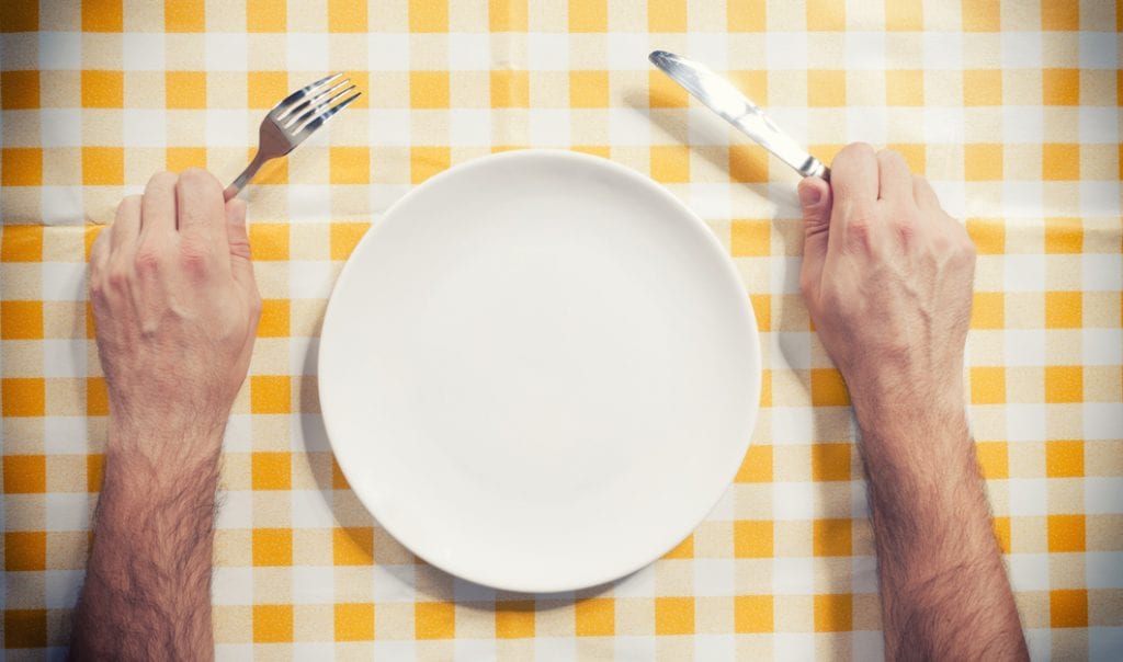
An empty dinner plate is a bad thing when you’re ready to eat. But a website with empty space is always nourishing for the eyes.
- Have an Intuitive Navigation Bar
One of the most annoying experiences you can have on a website is being unable to figure out where you are or where to go because you have too many buttons to click to get where you want.
Visitors are coming to your website for a specific reason, and they should be able to find their way around easily. If they don’t find what they need quickly enough, they will leave immediately.
Make your site logical and put information in front of your user instead of making them guess where it could be. Use icons to aid navigation and make buttons easy to find.
As a rule of thumb, keep important information such as contact details, services, or prices above the fold, so that visitors can see them first.

Ever been browsing a site and been unable to navigate to where you need to go? Yeah. It’s one of the fastest ways to have someone bounce off your site.
- Provide a Stellar Reading Experience
When a visitors lands on your website’s blog what is their first reaction? If they’re immediately heading for the “close” button, then you’re doing something wrong.
The goal of your blog should be to offer people the information they need to solve their problems. But that doesn’t mean that if the content is good, the way it’s packed is no longer important. Think about it this way, would you read an article that looks like a giant block of text? Probably not.
One of the most important things people judge a website by is how easy it is for them to read your content. To make it easy, pay attention to these elements:
- Font size: A font size of 12pt was cool and easy to read ten years ago. Now, when even your phone has a high-resolution screen, you need something bigger. So make sure the text is large enough to be read easily.
- Font Choice: If you think Comic Sans sends the same message as Helvetica, you are very wrong. Different font types say different things about your brand. Some make your webpage look modern while others make it look retro. Make sure you are using the right font for the job.
- Line length and spacing: Take a book and open it to a random page. Assuming it’s a good book, you will find that there aren’t more than 50-75 characters per line. That’s because it’s hard for the eye to focus when there’s a chunk of text. Also, it’s hard for the eye to read the next line if the lines are too close together.
- Include Email Subscription Boxes
Your email subscription box is one the most important aspects of transforming your website from a listing of products and services into a lead generation tool. We can’t stress this enough: collecting emails is one of the best ways to grow your customer database and consequently your business.
Make sure your email subscription boxes are visible. For instance, don’t place them at the end of a page because most visitors leave a website after scrolling 40% of the way down the page. They won’t even know they had the chance to subscribe if you put your opt-in form at the bottom of the page.
Try to make it as easy as possible for people to enter their email addresses. Install opt-in forms that come pre-filled with instructions. Embed a data capture form instead of a link that sends visitors to a different signup page.
- Add Social Buttons
A lot of small business owners wonder about the impact of social sharing. “Are my social media sharing buttons improving conversion rates? Is all this sharing really doing anything to my bottom line?” These are certainly valid questions.
The short answer is yes; social buttons can make the difference between a successful business and one that sinks into oblivion.
According to one study, Millennial shoppers are twice as likely to buy a product they’ve shared on social media. Even for non-Millennial shoppers, social sharing can influence the purchasing decision by up to 40%. The study also shows that friends or acquaintances that were exposed to the shares of products are more likely to make a purchase.
So make sure to include all relevant social buttons to your WordPress website. “Relevant” is the keyword here. If your audience spends most of their time on Instagram and Snapchat, maybe you shouldn’t include your LinkedIn and Facebook profiles.
- Add a Compelling CTA Button on Every Page
You spend time and money to promote your small business and bring in new customers. You create fresh, original content that adds value to your prospects’ lives. But if you neglected one important aspect and all your effort goes to waste: you didn’t include a compelling CTA button.
According to research by Small Business Trends, nearly 70% of small business websites don’t have a call-to-action button. Most of them think that CTAs are annoying and are driving customers away. But here’s the thing: if you don’t ask your prospects to take action, they are going to leave without buying your products or subscribing to your newsletter.
Even if you have CTA buttons on your website, there are a lot of design elements that can make or break the outcome. Color, for instance, plays an important role in your customer’s decision-making process. Red creates a sense of urgency and is often used for sales. Blue is the color of trust, order, and loyalty and is often used by banks and professional businesses to convey a sense of security.
- Install the Yoast SEO Plugin
While it’s tempting to focus solely on the aesthetics of your WordPress website design, its functionality is just as important. Yoast SEO plugin is one of the easiest ways to optimize a website for search engines. The tool allows you to add SEO titles, meta keywords, and meta descriptions to each page of your WordPress website. If you want to be sure search engines will be able to crawl your site and rank it high in search results, then you should definitely install the Yoast SEO plugin.

Being buried under your competitors in search results is a lot less fun (and profitable) than being buried by your kids at the beach.
- Keep It Simple, Stupid
Cluttered pages, bizarre color schemes, and weird font sizes and styles are ineffective and can hurt your website’s ranking. Design your website with the user’s intent in mind. Keep the design simple and add directional cues pointing toward what might be of interest to your prospects. Pay special attention to the colors you use as well. Not only can they can have a psychological effect, but they can make the difference between easy-to-read copy and an annoying website.
- Include Images
Compelling offers, discounts, and great content will help you grab the attention of your visitors, but a powerful image will help them remember your website. According to scientists, people remember visual content six times more easily than text.
If you want your WordPress website design to generate more conversions, remember to include strong imagery, such as high-resolution photographs, infographics, even videos.

We could write 1,000 words on how relaxing the beach is. Or we could show you this image. Which is more persuasive?
- Make It Responsive
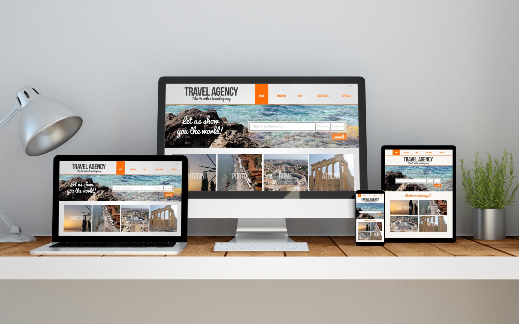
Take your smartphone and use it to navigate your small business’s website. How does it look? Does it load fast? Do you have to scroll to the right and left to read the content? Then you have a problem.
As more and more people switch to mobile devices over desktop computers, it has become evident that small businesses need to make their websites responsive. In other words, they need to make sure that their sites display on any device without any problems.
Conclusion
When it comes to good WordPress website design, it’s not just about the looks – it has to work well too. Put yourself in your visitor’s shoes and try out your design. Test your navigation menu, click all the buttons to see if they’re working, and make sure everything is clear, logical and easy to use. Otherwise you might end up with a pretty site that doesn’t convert.
It’s a harsh reality, but you rarely get a second chance to make a good impression. That is why your WordPress web design is so important. Keep these ten points in mind, and you’ll be well on your way to creating a website that converts visitors into customers at a very high rate.
If you find the process of designing a website on your own intimidating, don’t hesitate to get in touch with us. We have the expertise and the creative skills to create websites that not only look professional, but work great, load fast, and are sure to impress your potential customers.


